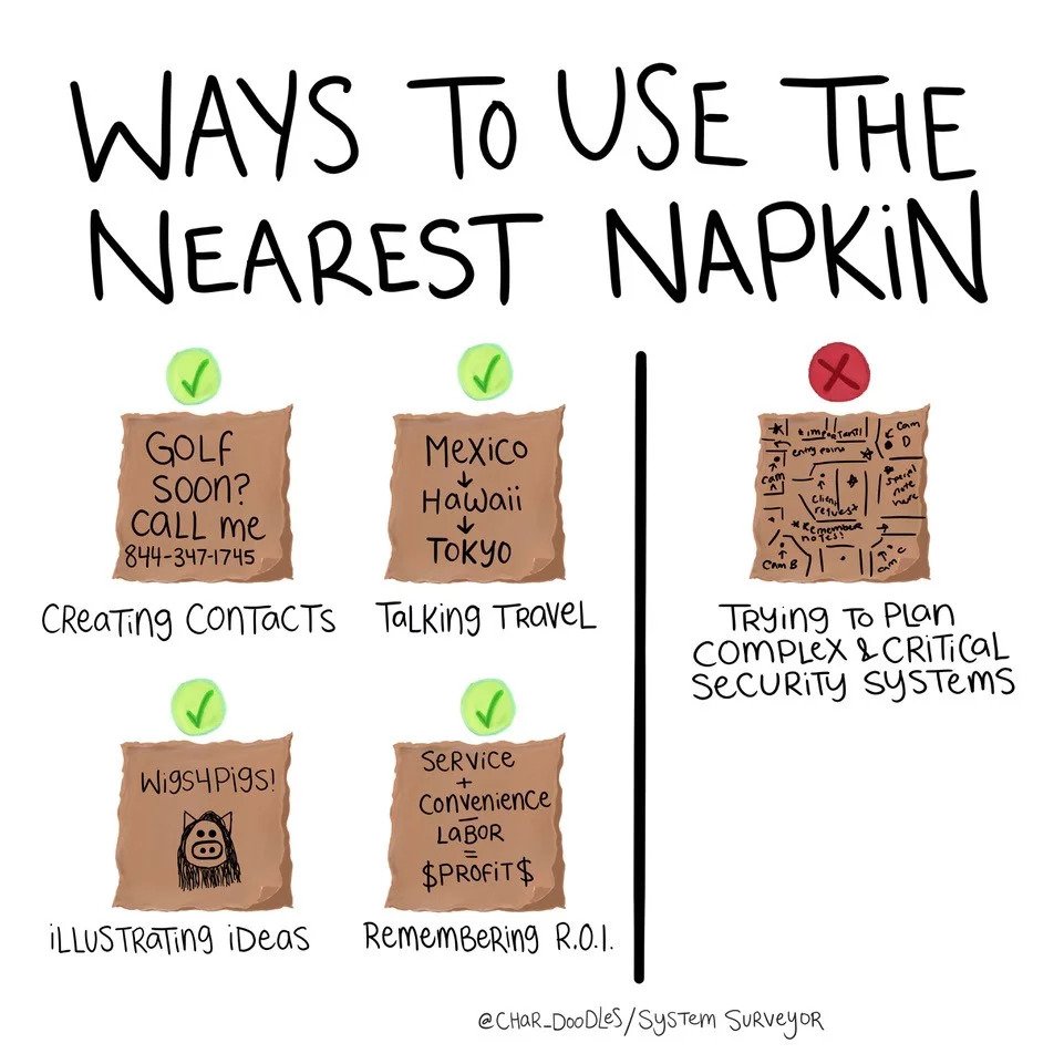
- We’ve all been there: you need to document something but don’t have the ideal resources, so you grab a pen and whatever is closest to you and start scribbling.
But when the information that needs documenting is an entire site survey, things can get messy. How messy? You show us – and you might win an iPad (yes, you read that correctly).
{{cta(’00c12de7-46a2-414b-bc64-5b378b3b125f’,’justifycenter’)}}
Though integration is centered around technology and operates within an increasingly technologically-driven world, almost 90% of system professionals still rely on paper floor plans. The complexity and breadth of customer data needed for a site survey can be very difficult to portray properly in a quick sketch – sometimes, so much so that the results are actually laughable. We decided to have some fun and hold a competition to see just how ridiculous they can be.
We’re looking for your most cringe-worthy site survey – whether it’s drawn on a napkin, a sticky note, a coffee cup lid, something more erratic, or just erratically in a notebook.
-
Enter to win a NEW iPad, fill in your info here and attach a photo of your ugliest site survey by June 26th, 2019.
The System Surveyor team will be posting our favorite entries anonymously to our social media channels, so tune in to see just how bad it can be. If your site survey is deemed the best of the worst, we will contact you individually to claim your reward.
Tired of trying to present complicated customer information with pens and graph paper? Digital floor mapping technology condenses holistic site survey data into a quick, simple platform – a much prettier presentation than the nearest napkin. Find out why people leave paper behind for a mobile system design tool that can help make them look more professional with their customers and stakeholders. Try It Free!
